Indian Post
Payment Bank
Redesigning Digital Banking Experience
Redesigning the mobile banking experience of India Post Payments Bank (IPPB) to make it more simple, accessible, and user-friendly, especially for users in rural and semi-urban areas.
8 Weeks
Project Duration
Solo Project
Team Size
UX Design
Discipline
Mobile App
Platform
Problem Statement
Core Problem
The existing India Post Payments App has a 52% task abandonment rate among rural users, primarily due to complex navigation, inconsistent UI patterns, and a design process that didn't align with users' mental models of banking.
Complex Login Process
Users struggle with multiple login options and confusing OTP flows, causing friction at the very first step.
Overwhelming Navigation
The app has 12+ options on the home screen, causing choice paralysis and task abandonment.
Multi-Step Money Transfer
The money transfer process requires 7+ steps and many users initiate transfers but abandon them midway.
Poor Trust Indicators
No visual feedback during transactions, causing users to tap multiple times thinking the action didn't register.
Goals & Objectives
Three measurable goals
Guiding the redesign process.
Reduce Cognitive Load
- •Simplify the home screen to 5 core features
- •Reduce steps in money transfer from 7 to 3
- •Task completion rate will increase by 40%
Improve Accessibility
- •Usable across digital literacy, age, and language preferences
- •Multilingual support for at least 3 Indian languages
- •80% first-time user success rate without assistance
Build Trust & Transparency
- •Real-time status updates for all transactions
- •Explicit feedback loops for critical actions
- •User-friendly receipts for every major transaction
35%
Increase in monthly active users
50%
Reduction in customer support calls
4.0+
Target app store rating
User Research
Critical Insights
Listening before designing — 8 interviews, 13 survey responses.
Users equate simplicity with trust
"Simple app looks safe"
Biometric login is strongly preferred
"Use fingerprint like PhonePe"
Feedback loops matter deeply
"I didn't know if money was sent"
Navigation labels are essential
"I guessed what buttons meant"
User Personas
Real people, real problems
Sunita Devi
42 · Rural Bihar · Daily Wage Worker
"I just want a fast and easy app — I shouldn't feel confused every time"
Needs
- Simple money transfers
- Hindi UI
- Biometric login
- Audio cues
Pain Points
- Confused by English-only UI
- Frustrated by OTP process
- Afraid of losing money
Ramesh Kumar
34 · Semi-urban Maharashtra · Small Shop Owner
"I just want to send money and check balance — nothing else"
Needs
- Quick balance check
- Fast transfers
- Simple receipts
- Reliable history
Pain Points
- Too many options on home
- Multi-step transfer flow
- No real-time feedback
Customer Journey
Emotions across every touchpoint
Step 1
Awareness
Hears about IPPB from a post office agent or family member
🤔 Curious but hesitant
→ Clear onboarding materials in local language
Step 2
Onboarding
Downloads app, fills long registration form
😕 Confused by English fields
→ Simplified form with auto-fill & vernacular support
Step 3
Login
Tries to log in — OTP doesn't arrive or expires
😤 Frustrated, considers quitting
→ Biometric login as primary, OTP as fallback
Step 4
Navigate
Sees 12+ icons on home — can't find what they need
😰 Overwhelmed, paralysed
→ Simplified 5-feature home with labels
Step 5
Transfer
Starts money transfer — 7 steps, confusing fields
😟 Anxious, makes errors
→ Streamlined 4-step transfer with progress
Step 6
Confirm
No confirmation screen — taps send multiple times
😣 Uncertain, distressed
→ Clear success animation + shareable receipt
Competitive Analysis
How IPPB compares
| Feature | PhonePe | Paytm | GPay | IPPB | Priority |
|---|---|---|---|---|---|
| Biometric Login | Yes | Yes | Yes | No | High |
| Navigation Redesign | Yes | Yes | Yes | No | High |
| Consistent Feedback | Yes | Yes | Yes | No | High |
| Multilingual Support | ~ Partial | Yes | Yes | No | High |
| Minimal Home Screen | No | ~ Partial | Yes | No | Medium |
| Transaction History | Yes | Yes | Yes | ~ Partial | Medium |
| Offline Support | ~ Partial | ~ Partial | No | No | Medium |
Biometric Login, Navigation Redesign, Consistent Feedback, Multilingual Support, Minimal Home Screen, Transaction History, Offline Support
Information Architecture
Restructured around 5 core tasks
Reduced from 12+ home screen items → 5 focused core features.
Send Money
Balance
History
Services
Profile
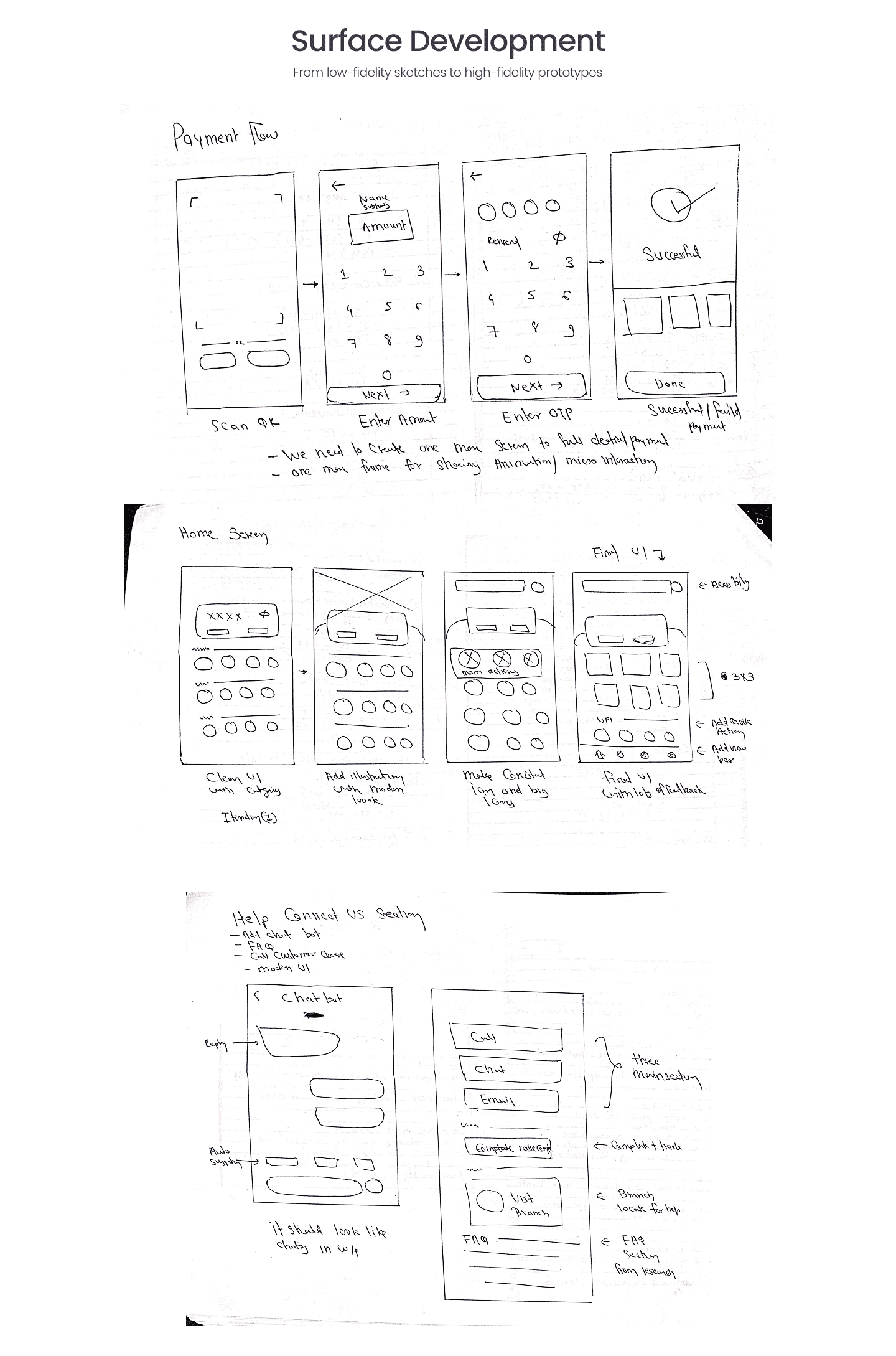
Surface Development
From low-fi sketches to high-fi prototypes
Payment flow, home screen iterations, and help & connect section.
Design System
Visual language built for trust
Colors
Primary
#C8003C
Secondary
#8A0546
Tertiary / BG
#F8F1F4
Typography
Inter — Display
Headings & emphasis
Inter — Body Medium
Interface copy
Noto Sans — Vernacular support
Hindi & regional scripts
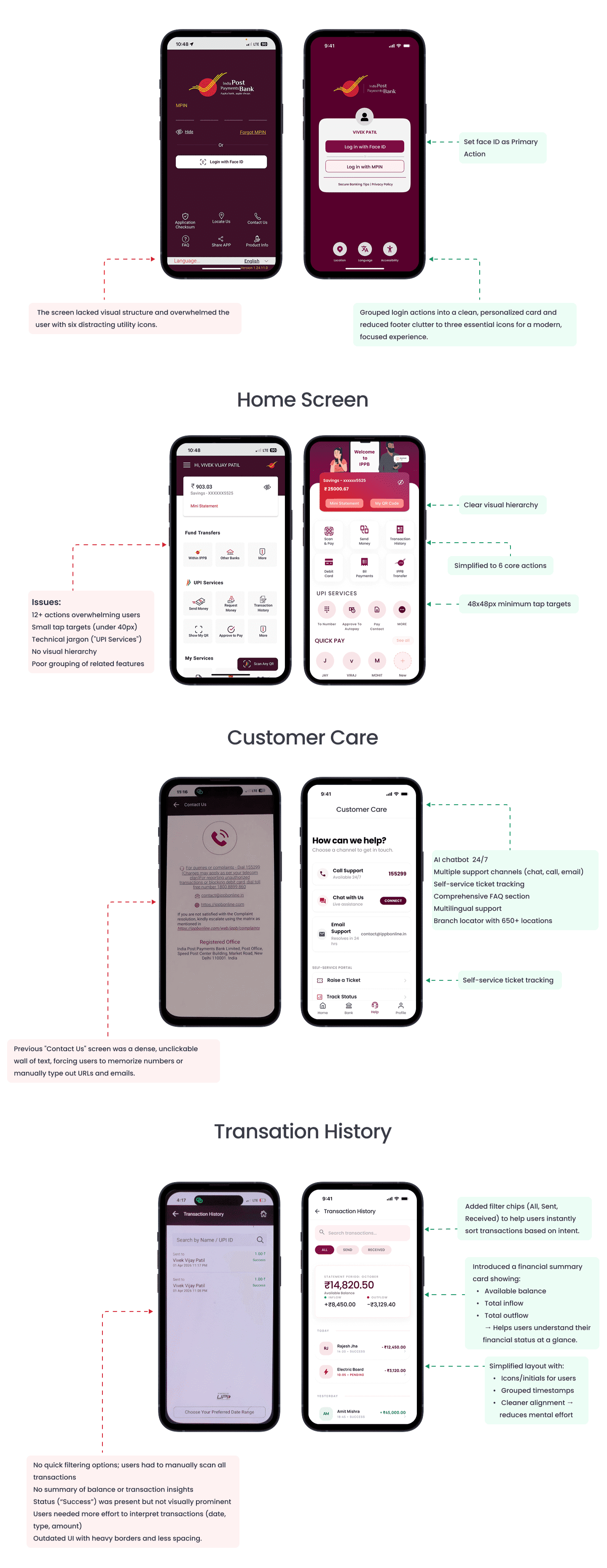
UI Redesign
Screen-by-screen transformation
Before → after comparisons across login, home, customer care and transaction history.
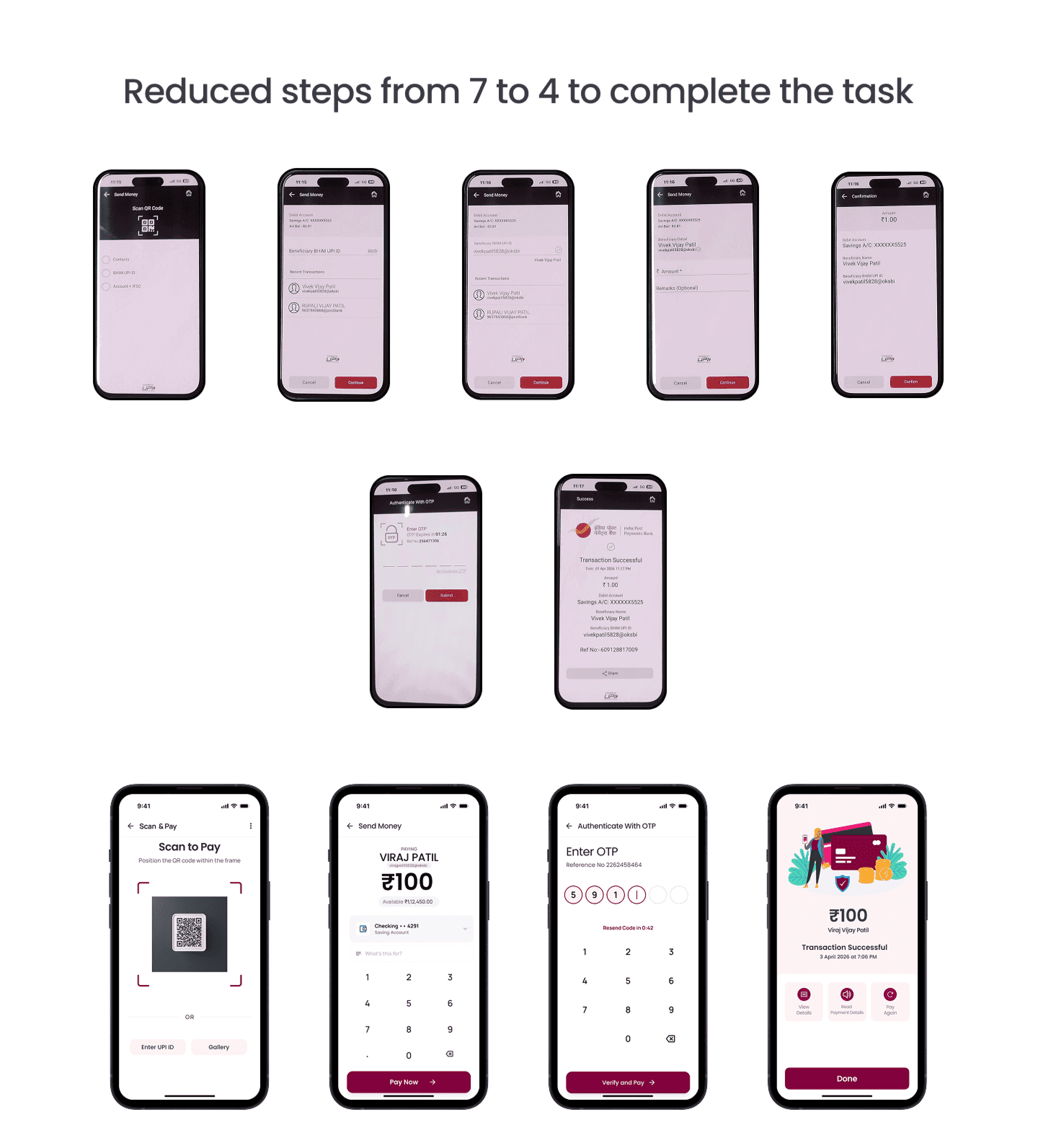
Flow Optimization
Reduced steps from 7 to 4
Streamlined the money transfer flow — scan, pay, verify, done.
Result
Measurable impact across every goal
Task Completion
Transfer Steps
Login Success
Satisfaction
Learnings
Key takeaways
- Simplicity builds trust — fewer options reduce anxiety for first-time users
- Vernacular-first design is critical for rural India adoption
- Real-time feedback loops are non-negotiable for financial transactions
- Contextual onboarding outperforms standalone tutorial screens
- Progressive disclosure helps users focus on one task at a time
Future Scope
What we'd do next
- ✦Voice-assisted navigation for users with low literacy
- ✦Offline-first architecture for low-connectivity areas
- ✦AI-powered spending insights and savings nudges
- ✦Expand multilingual support to 12+ Indian languages
- ✦Merchant QR payments with simplified checkout
- ✦Government scheme eligibility checker